Colour Psychology. An Autumn Colour Palette
- Freya Deabill

- Oct 18, 2021
- 3 min read

The power of colour psychology in branding is incredible. The feelings and emotions that colours can emit can work more efficiently than words and images, so getting the colour palette right for your brand is something you want to work hard on.

When choosing colours for your brand identity, a perfect place to start is by looking at the seasons. Everyone has a favourite season right? And if you ask them why it will be both physical and emotional things that they list.
I love Autumn, I love being cosy, the colours of the leaves turning through yellows to oranges to reds, and the noise they make, the warmth & crackle of bonfires and the dull creams of harvest. Chunky knits. Hot Chocolates. The glittery dew on spiders webs (not the spiders mind!). I love the anticipation of Christmas sparkle round the corner and cold nights in-front of the fire.
Autumn is my season.
When you start looking at the words I chose to describe Autumn its easy to see how this can start to build a visual.


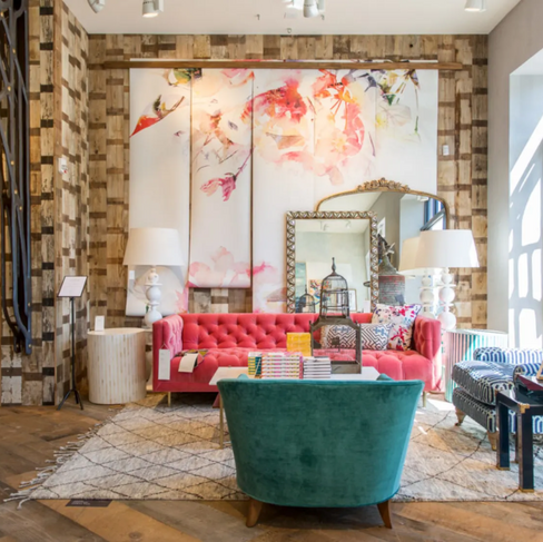
It is natural then for me, as a consumer to be attracted to brands which follow this ethos. I love colour, but rich, muted natural tones. Anthropologie is a true favourite, along with Graham & Green, brands who aren't afraid of colour but keep the feel of their values firmly in warm, Autumnal roots. Their use of natural tactile materials, soft welcoming textures and luxurious approachable language really appeals to me, and my home and life reflects my love of these things.


When I first start working with a new client I use a fabulous kick off Q&A where their describing words are revealed in the answers, completely naturally and un-provoked. Some people feel their brand is warm, approachable, friendly. Others may describe their personality as lively, fun and creative. Another may choose words like luxurious, cutting edge, dramatic. Each selection of key words omit a different feeling, and therefore will speak too a different customer. If you have a business plan, or have completed a brand Q&A go through the words you have already written and see what colours they evoke.


Businesses that naturally fall into an Autumn colour palette are those who support others, or offer a cultural, eccentric lifestyle choice. Brands that want to HUG YOU and intrigue you.
Community.
Historical.
Environmental.
Nature Based.
Sustainable.
Ethical.
Cultural.
Intense.
Authentic.
Supportive.
Brave.
There are two things to consider when choosing your colour palette / season.
1. You. Is your brand or business focussed on you as the driver. Are you client facing, one on one with your consumer? Will your personality be a huge draw to those who choose to engage with your business or brand?
2. Your customer. There is no point choosing a luxurious, exclusive palette if your customers are looking for homely and huggable. You must consider who your target audience are as part of this process. Make up your ideal customer, give them a name... what do they wear, what does their house look like? What art is on their walls? What do they do at the weekend?
All these touch points in your business will help you reveal right approach.
There are of course many other aspects that make up your 'brand' of course. The colour palette cannot do it all. There are other things to consider such as the typography & language you choose. The imagery you use, the textures, the patterns and of course your logo or visual pen on paper mark. Over the course of my blog I will choose one of these elements and talk you through them so you can fully understand the depths a brand should delve too to be successful and attract your tribe of loyal followers.
TAKE MY FREE COLOUR QUIZ TO FIND OUT WHICH SEASONAL COLOUR PALETTE YOUR PERSONA & BRAND FALL INTO...


Comments